
Vondel Desks · Positioning, identity, website and CMS
From a desk for rent to a place worth choosing.
We redesigned the Vondel Desks brand and website around its main offer: your own desk, one minute from Vondelpark.
See the transformation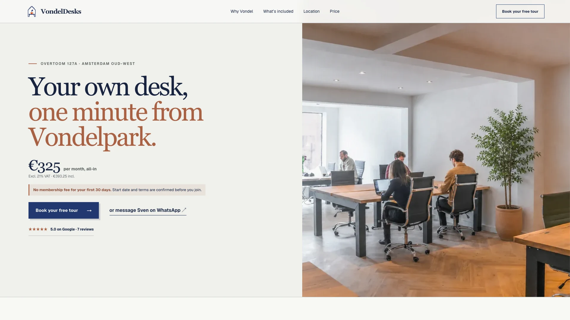
Positioning · Identity · UX and conversion · Website · CMS
The business was distinctive. The website made it look interchangeable.
The Vondelpark location, the price, the reviews and direct contact with the team were already there. We rebuilt the website around the questions people ask when choosing a workspace, putting those details first and making it easier to arrange a tour.
- Place
- One minute from Vondelpark
- Price
- €325 per month, all-inExcluding VAT
- Proof
- 5.0 on Google7 published reviews
- Action
- Tour or WhatsAppDirectly with the team
What makes a desk worth the visit?
The design helps visitors understand the membership and decide whether to arrange a visit.
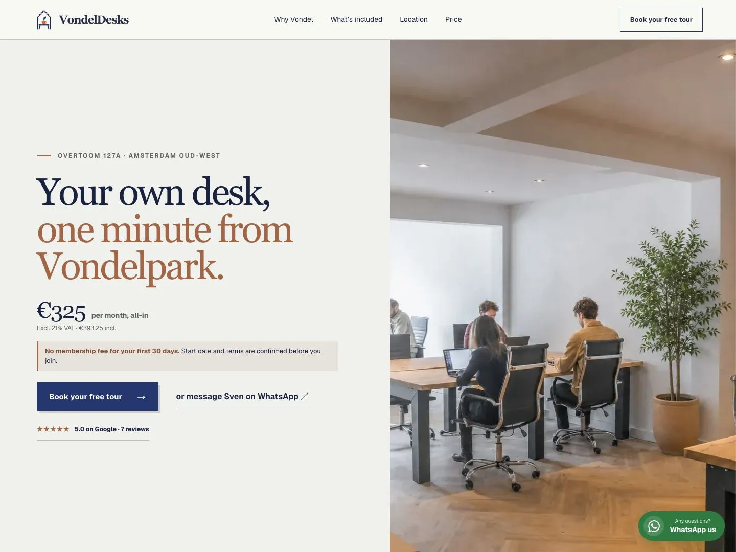 01
Lead with one promise
The opening screen shows the main offer: your own desk, one minute from Vondelpark.
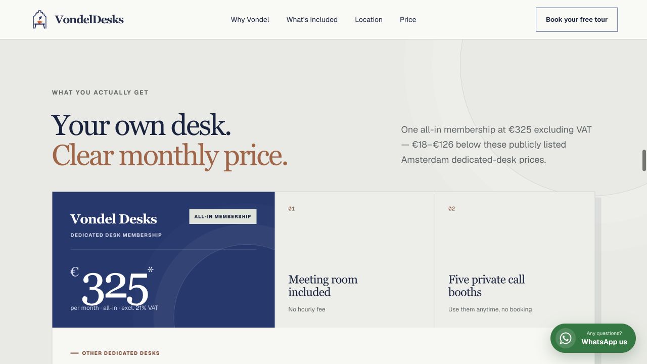 02
Turn price into proof
€325 is framed against what is included and what comparable Amsterdam desks charge.
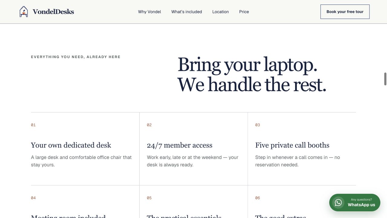 03
Make the membership tangible
24/7 access, five call booths, a meeting room and the useful extras become reasons to join.
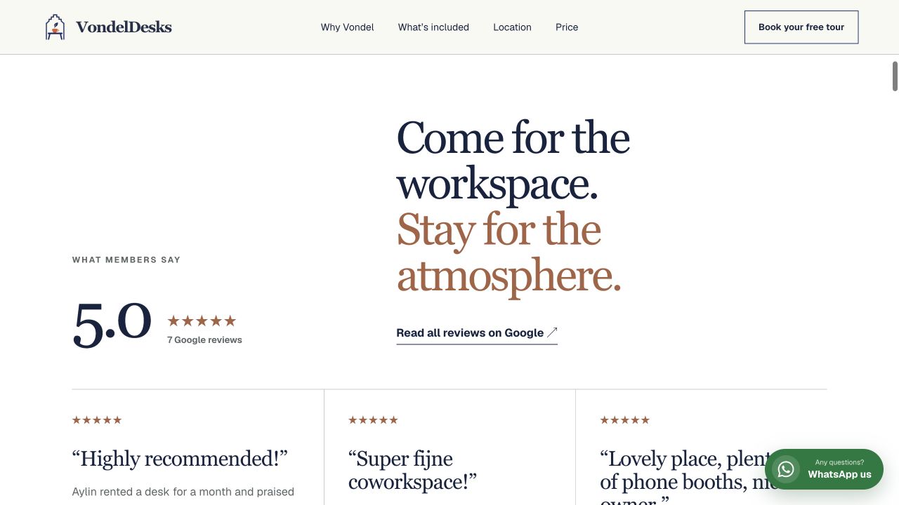 04
Let members sell the feeling
Verified reviews show what members think of working here.
We turned Vondelpark from an address into the idea.
Navy, terracotta and warm paper give the identity its quiet warmth. The new mark brings the desk and its Vondelpark setting into one recognisable symbol.
The identity behind the website.
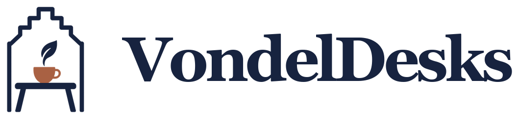
An Amsterdam canal house, desk and coffee cup come together in the new symbol. The Vondel Desks wordmark and navy, copper and ivory palette give the website its own character.
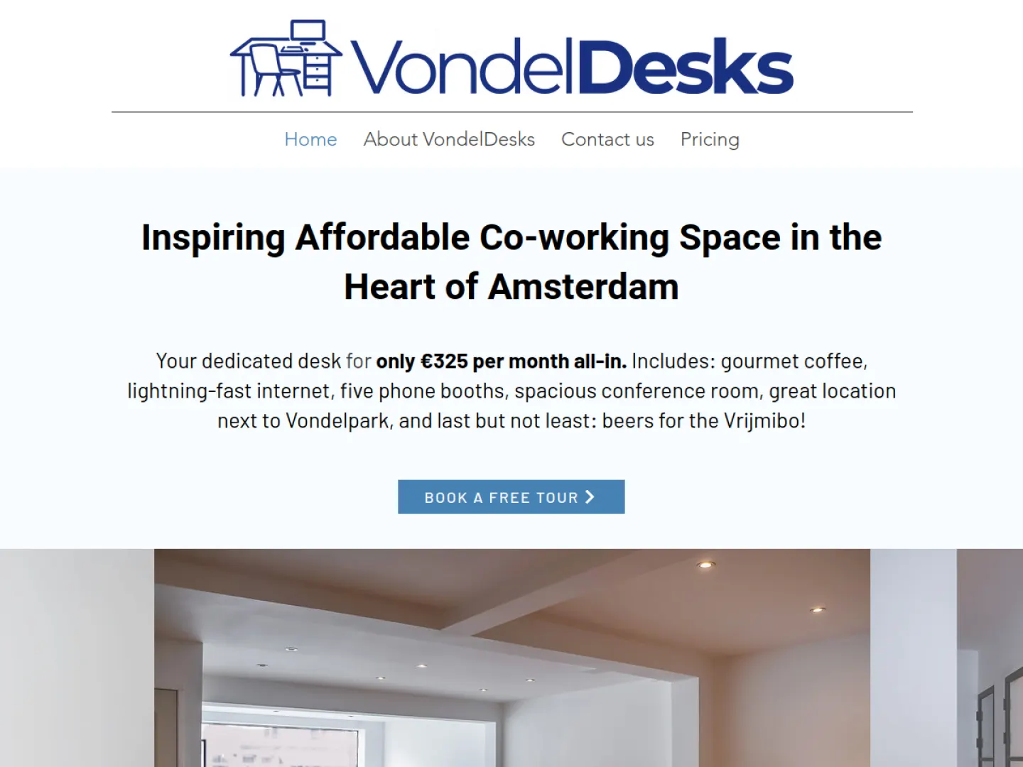
Before and afterThe same space, seen with fresh eyes.
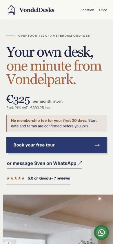
A small screen still has a big job to do.
On a phone, visitors can still explore the space, check the price, read the reviews and get in touch.
The offer and contact options stay clear on mobile.
The new site keeps the proposition, price and next step visible, readable and ready for a tour or WhatsApp conversation on a phone.
- Price and introductory terms above the fold
- Inclusions and member proof in the same story
- A direct route to the team from every key decision point
Designed to sell. Built to keep working.
The new brand is live on a website the client can manage.
Sell
Positioning, identity and a guided decision journey.
Measure
Consent-aware analytics and conversion events.
Operate
CMS, hosting, redirects and production health.
“Fantastic new website! Very proactive, which meant it took little of my time, and I now have a website that runs perfectly.”
Your turn
Is your business stronger than your website makes it look?
Send us your current website. We will look at what it says about your business and where the design could work harder.

Rafi FriedmannFounder
You work with Rafi from the first conversation to launch. No account managers and no handovers between teams.